Hi, now as of April 2020, Covid-19 pandemic in the world is getting more massive. New confirmed cases are increasing, so are death cases increasing. In this case, I try to make data analysis related to the covid-19 pandemic in the world and compare it with the Indonesia Country, because I am a citizen of Indonesia. This data analysis is a learning tool for me to improve my ability in the field of data science. As for the difference in data, it is possible that there is data from the latest updated sources. But it does not reduce the technical content of implementing this data analysis method. I did a data analysis coding in Python on the Jupyter Notebook via Google Collaboratory web application, the libraries I used; Pandas, Numpy, Matplotlib & Seaborn.
Okay, let’s get started.
Dataset
The source dataset is taken from the github repository, I included the dataset source link below this article. The dataset consists of a time series of confirmed & death cases in global and US. For this exploratory data analysis, I only take data that occurs globally. Then from the global dataset, I specify data to Indonesia Case.
Libraries
The libraries that I used is: Pandas & Numpy for data manipulation and Matplotlib & Seaborn for data visualization. Then I wrote the code on Jupyter Notebook via Google Collaboratory.
import warnings
import pandas as pd
import seaborn as sns
import matplotlib.pyplot as plt
import matplotlib.ticker as ticker
import numpy as np


warnings.simplefilter(action='ignore', category=FutureWarning)
pd.plotting.register_matplotlib_converters()
Import dataset:
# Import Source
covid_confirmed = pd.read_csv('https://raw.githubusercontent.com/CSSEGISandData/COVID-19/master/csse_covid_19_data/csse_covid_19_time_series/time_series_covid19_confirmed_global.csv')
covid_deaths = pd.read_csv('https://raw.githubusercontent.com/CSSEGISandData/COVID-19/master/csse_covid_19_data/csse_covid_19_time_series/time_series_covid19_deaths_global.csv')
To more easily manipulate data, I have analyzed what data is needed. I deleted data that is not needed, and then did set indexes & transpose dataframe. The purpose of this transpose is to facilitate the data visualization later.
# Drop, set index, transpose
confirmed = covid_confirmed.drop(columns=['Province/State', 'Lat', 'Long']) \
                           .set_index('Country/Region') \
                           .T
confirmed.columns.name = None

deaths = covid_deaths.drop(columns=['Province/State', 'Lat', 'Long']) \
                     .set_index('Country/Region') \
                     .T
deaths.columns.name = None
Global Data Wrangle
# World confirmed & deaths: reset index, rename columns, add column Total, change datatype Date

world_confirmed = confirmed.reset_index() \
                           .rename(columns={'index': 'Date'})
world_confirmed['Confirmed_Cases'] = world_confirmed.sum(axis=1)
world_confirmed['Date'] = pd.to_datetime(world_confirmed['Date'])

world_deaths = deaths.reset_index() \
                     .rename(columns={'index': 'Date'})
world_deaths['Deaths_Cases'] = world_deaths.sum(axis=1)
world_deaths['Date'] = pd.to_datetime(world_deaths['Date'])
In the code below, I merged 2 columns from 2 different dataframes (confirmed case & death case). From the merged dataframe, I created a new column for the mortality rate which is the quotient of the total confirmed cases and the total death case. Then I defined the value of the variable to be visualized later.
# Show Date & Total only
world_confirmed_total = world_confirmed[['Date', 'Confirmed_Cases']]
world_deaths_total = world_deaths[['Date', 'Deaths_Cases']]

# Merge confirmed & deaths, add new column Death_Rate
global_covid = pd.merge(world_confirmed_total, world_deaths_total, on='Date')

global_covid['Death_Rate'] = global_covid['Deaths_Cases'] / global_covid['Confirmed_Cases']
# global_covid

# Last row values for visualization
Global_Date_Val = global_covid.tail(1)['Date'].dt.strftime('%d %b %Y').values[0]
Global_Confirmed_Cases_Val = global_covid.tail(1)['Confirmed_Cases'].values[0]
Global_Deaths_Cases_Val = int(global_covid.tail(1)['Deaths_Cases'].values[0])
Global_Death_Rate_Val = float(global_covid.tail(1)['Death_Rate'].values[0]) * 100

# Summary dataframe for visualization
global_sum_df = pd.DataFrame({'Cases':['Confirmed Cases', 'Deaths Cases'], 'Total':[Global_Confirmed_Cases_Val, Global_Deaths_Cases_Val]})
# global_sum_df
Indonesia Data Wrangle
Data for Indonesia, I only take Indonesia country column data from the dataset and did the same thing as the code for the global case above.
# Select column Indonesia, reset index, rename columns
indo_confirmed = confirmed[['Indonesia']]
indo_confirmed = indo_confirmed.reset_index() \
                               .rename(columns={'index': 'Date', 'Indonesia': 'Confirmed_Cases'})

indo_deaths = deaths[['Indonesia']]
indo_deaths = indo_deaths.reset_index() \
                         .rename(columns={'index': 'Date', 'Indonesia': 'Deaths_Cases'})
In contrast to Global code, for time series, I filtered the data from the end date of February 2020, because in Indonesia, there was a covid-19 case in the first week of March 2020.
# Filter by date
indo_confirmed['Date'] = pd.to_datetime(indo_confirmed['Date'])
indo_confirmed = indo_confirmed[indo_confirmed['Date'] > '2020-02-28']

indo_deaths['Date'] = pd.to_datetime(indo_deaths['Date'])
indo_deaths = indo_deaths[indo_deaths['Date'] > '2020-02-29']

# Merge confirmed & deaths
indo_covid = pd.merge(indo_confirmed,
                     indo_deaths[['Date', 'Deaths_Cases']],
                     on='Date')
indo_covid['Death_Rate'] = indo_covid['Deaths_Cases'] / indo_covid['Confirmed_Cases']
#indo_covid

# Last row values
Date_Val = indo_covid.tail(1)['Date'].dt.strftime('%d %b %Y').values[0]
Confirmed_Cases_Val = indo_covid.tail(1)['Confirmed_Cases'].values[0]
Deaths_Cases_Val = int(indo_covid.tail(1)['Deaths_Cases'].values[0])
Death_Rate_Val = float(indo_covid.tail(1)['Death_Rate'].values[0]) * 100

# Summary dataframe
sum_df = pd.DataFrame({'Cases':['Confirmed Cases', 'Deaths Cases'], 'Total':[Confirmed_Cases_Val, Deaths_Cases_Val]})
#sum_df
Data Exploratory
At this step, we begin to explore the data and visualize it.
Bar Plot
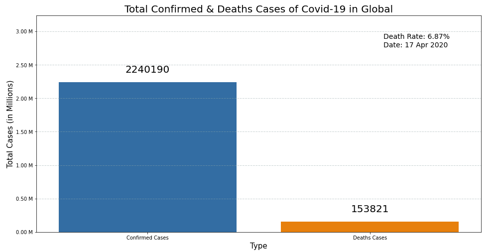
# Total cases visualization - Global
plt.figure(figsize=(16, 8))
viz = sns.barplot(data=global_sum_df, x='Cases', y='Total', label="Extra label on the legend")
plt.xlabel('Type', fontsize=15)
plt.ylabel('Total Cases (in Millions)', fontsize=15)
plt.title('Total Confirmed & Deaths Cases of Covid-19 in Global', fontsize=20)
plt.grid(color='#95a5a6', linestyle='--', linewidth=1, axis='y', alpha=0.5)

@ticker.FuncFormatter
def million_formatter(x, pos):
    return "%.2f M" % (x/1000000)
ax = viz
ax.yaxis.set_major_formatter(million_formatter)


# Annotate axis = seaborn axis
space = Global_Confirmed_Cases_Val + 1000000
for p in viz.patches:
             viz.annotate("%.f" % p.get_height(), (p.get_x() + p.get_width() / 2., p.get_height()),
                 ha='center', va='center', fontsize=20, color='black', xytext=(0, 25),
                 textcoords='offset points')
_ = viz.set_ylim(0,space) # To make space for the annotations

# Text
textstr = 'Death Rate: %.2f%%\nDate: %s'%(Global_Death_Rate_Val, Global_Date_Val)
plt.gcf().text(0.73, 0.77, textstr, fontsize=14)
plt.show()
The above code gives the visualization below:
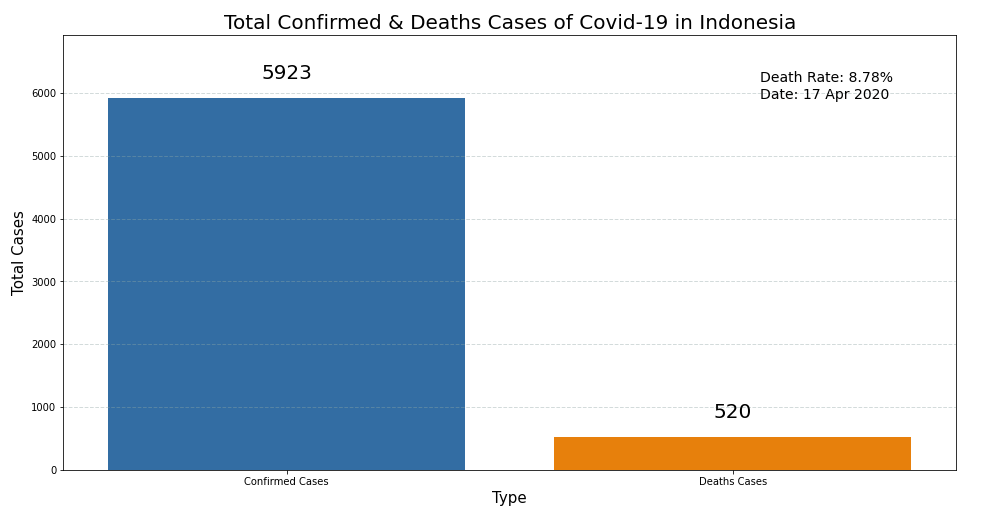
# Total cases visualization - Indonesia
plt.figure(figsize=(16,8))
viz = sns.barplot(data=sum_df, x='Cases', y='Total', label="Extra label on the legend")
plt.xlabel('Type', fontsize=15)
plt.ylabel('Total Cases', fontsize=15)
plt.title('Total Confirmed & Deaths Cases of Covid-19 in Indonesia', fontsize=20)
plt.grid(color='#95a5a6', linestyle='--', linewidth=1, axis='y', alpha=0.4)

# Annotate axis = seaborn axis
space = Confirmed_Cases_Val + 1000
for p in viz.patches:
             viz.annotate("%.f" % p.get_height(), (p.get_x() + p.get_width() / 2., p.get_height()),
                 ha='center', va='center', fontsize=20, color='black', xytext=(0, 25),
                 textcoords='offset points')
_ = viz.set_ylim(0,space) # To make space for the annotations

# Text
textstr = 'Death Rate: %.2f%%\nDate: %s'%(Death_Rate_Val,Date_Val)
plt.gcf().text(0.73, 0.77, textstr, fontsize=14)
plt.show()
The above code gives the visualization below:
Line Plot
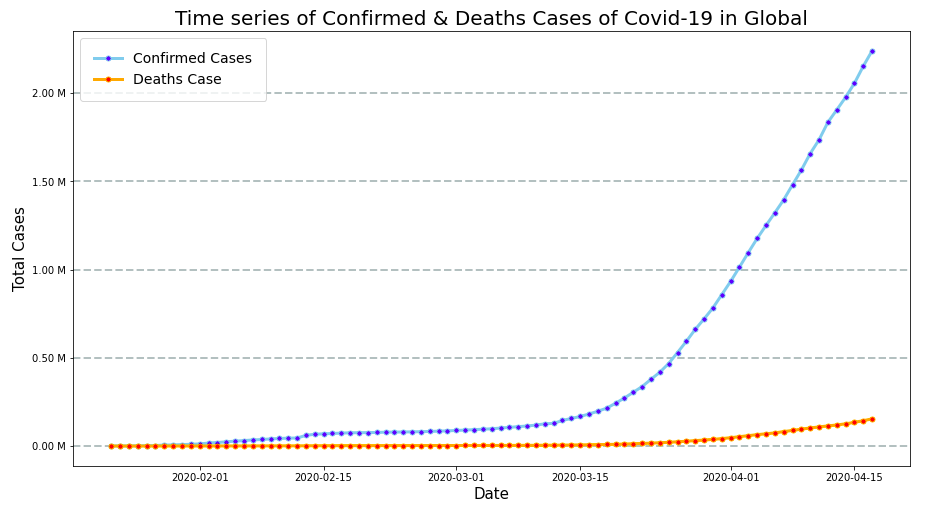
# Time series of cases visualization - Global
plt.figure(figsize=(15,8))
plt.plot('Date', 'Confirmed_Cases', data=global_covid, marker='o', markerfacecolor='blue', markersize=5, color='skyblue', linewidth=3, label="Confirmed Cases")
plt.plot('Date', 'Deaths_Cases', data=global_covid, marker='o', markerfacecolor='red', markersize=5, color='orange', linewidth=3, label="Deaths Case")
plt.xlabel('Date', fontsize=15)
plt.ylabel('Total Cases', fontsize=15)
plt.title('Time series of Confirmed & Deaths Cases of Covid-19 in Global', fontsize=20)
plt.grid(color='#95a5a6', linestyle='--', linewidth=2, axis='y', alpha=0.7)
plt.legend(borderpad=1,fontsize=14)


@ticker.FuncFormatter
def million_formatter(x, pos):
    return "%.2f M" % (x/1000000)

plt.gca().yaxis.set_major_formatter(million_formatter)

plt.show()
The above code gives the visualization below:
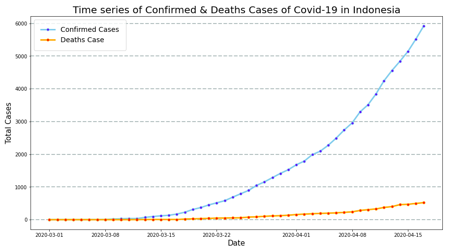
# Time series of cases visualization - Indonesia
plt.figure(figsize=(15,8))
plt.plot('Date', 'Confirmed_Cases', data=indo_covid, marker='o', markerfacecolor='blue', markersize=5, color='skyblue', linewidth=3, label="Confirmed Cases")
plt.plot('Date', 'Deaths_Cases', data=indo_covid, marker='o', markerfacecolor='red', markersize=5, color='orange', linewidth=3, label="Deaths Case")
plt.xlabel('Date', fontsize=15)
plt.ylabel('Total Cases', fontsize=15)
plt.title('Time series of Confirmed & Deaths Cases of Covid-19 in Indonesia', fontsize=20)
plt.grid(color='#95a5a6', linestyle='--', linewidth=2, axis='y', alpha=0.7)
plt.legend(borderpad=1,fontsize=14)
plt.show()
The above code gives the visualization below:
Conclusion
So, This is short conclusion for Covid-19 Data Analysis in Global and Indonesia:
Per 17 April 2020:
1. The death rate in Indonesia (8.78%) is higher than Global (6.87%).
2. Based on the Line plot, the lines on the chart have not yet reached the peak point or the sloping graphs, it means that Social Distancing efforts in Indonesia and globally in The World continue until the virus stops spreading and the number of new cases stops.
According to health and statistic experts, from the peak point of Covid-19 to the cessation of the spread took about 3 months. CMIIW. It’s not including global economic recovery. Hopefully the Covid-19 pandemic in the world, especially in Indonesia, is quickly handled properly and resolved.
Finally, this basic exploratory data analysis can be useful for you as a reference for learning Basic Data Science with Python. I also include my source code on github: https://gist.github.com/syamdev/d5a45fe3cfd6a9f1073094b1ee8a6e53.
I also write this article and other articles about data science and about coding programming on my blog, Please visit my blog on sy4m.com. If you have questions or feedback, please fill comment in the comment box. Thank you
Dataset source:
https://github.com/CSSEGISandData/COVID-19/tree/master/csse_covid_19_data/csse_covid_19_time_series